


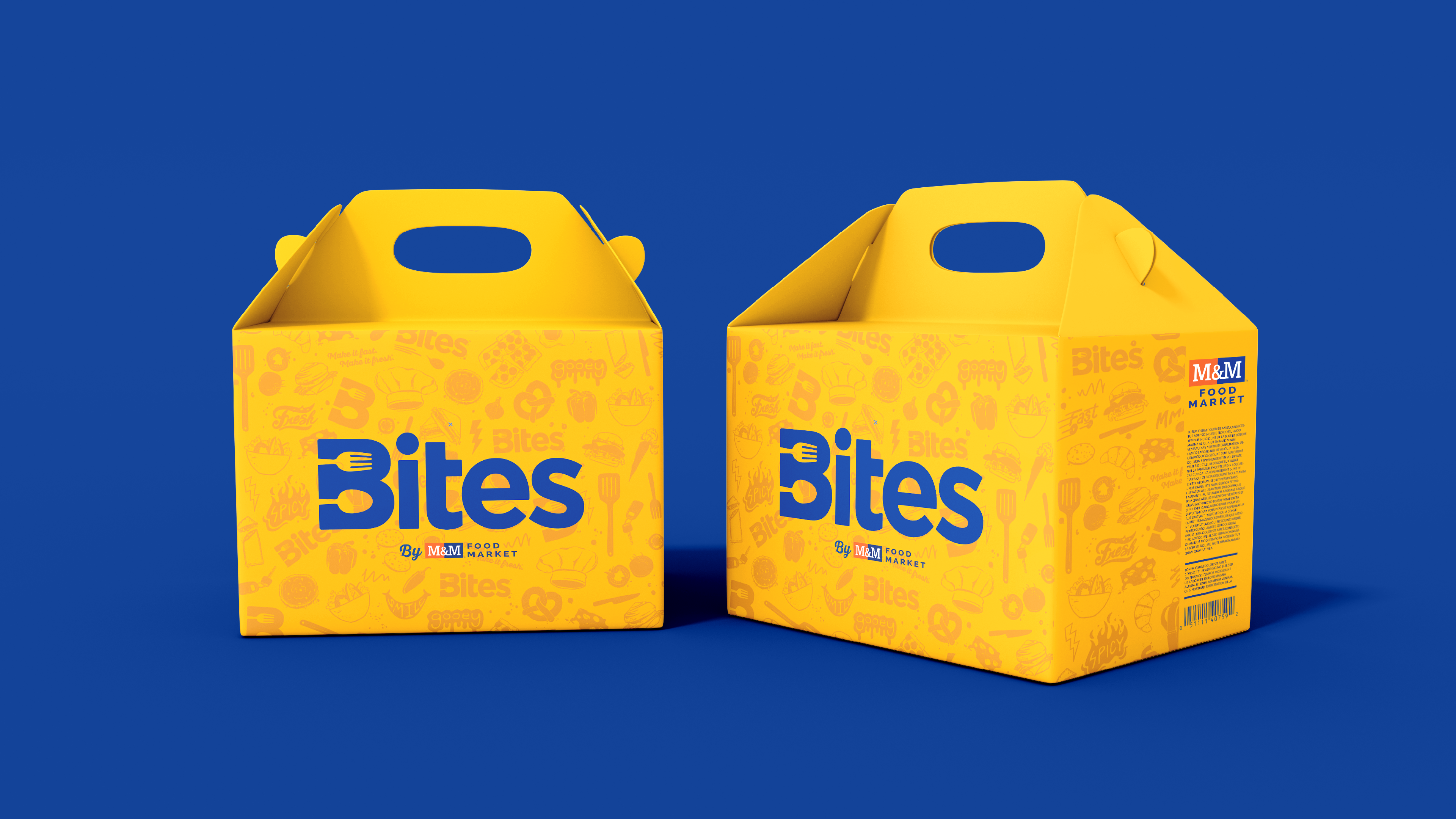
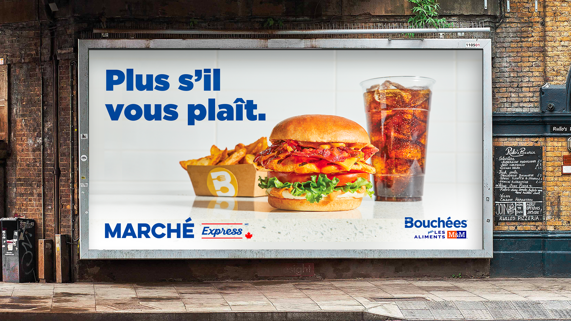
The “B” icon is a signature brand element for Bites and Bouchées. It’s the unifying element that is used in all English and French brand expressions. When the icon is rotated, it becomes an “M” for “market.”



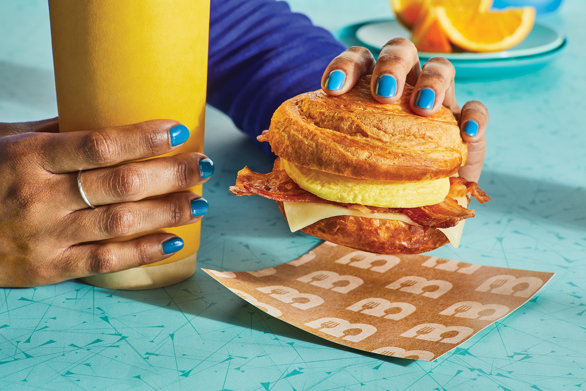


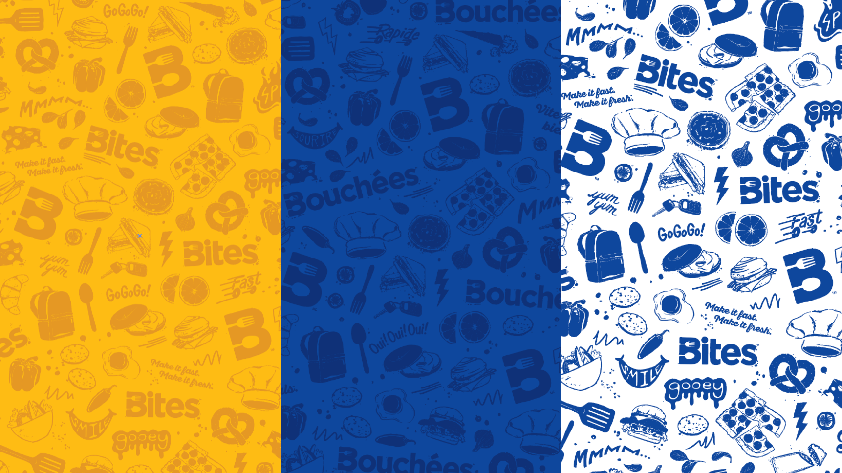
The brand pattern communicates a fuller brand story about the Bites offering and the On the Run experience. Three versions of the pattern were developed so that the brand could be fully expressed in all of it's locations.







Agency: Brand Design at VML
GDD: Dave Swearengen
DD:Andrew Mirakian
ADD: Carolyn Pakorney
Ilustrator: Kevin Lee