

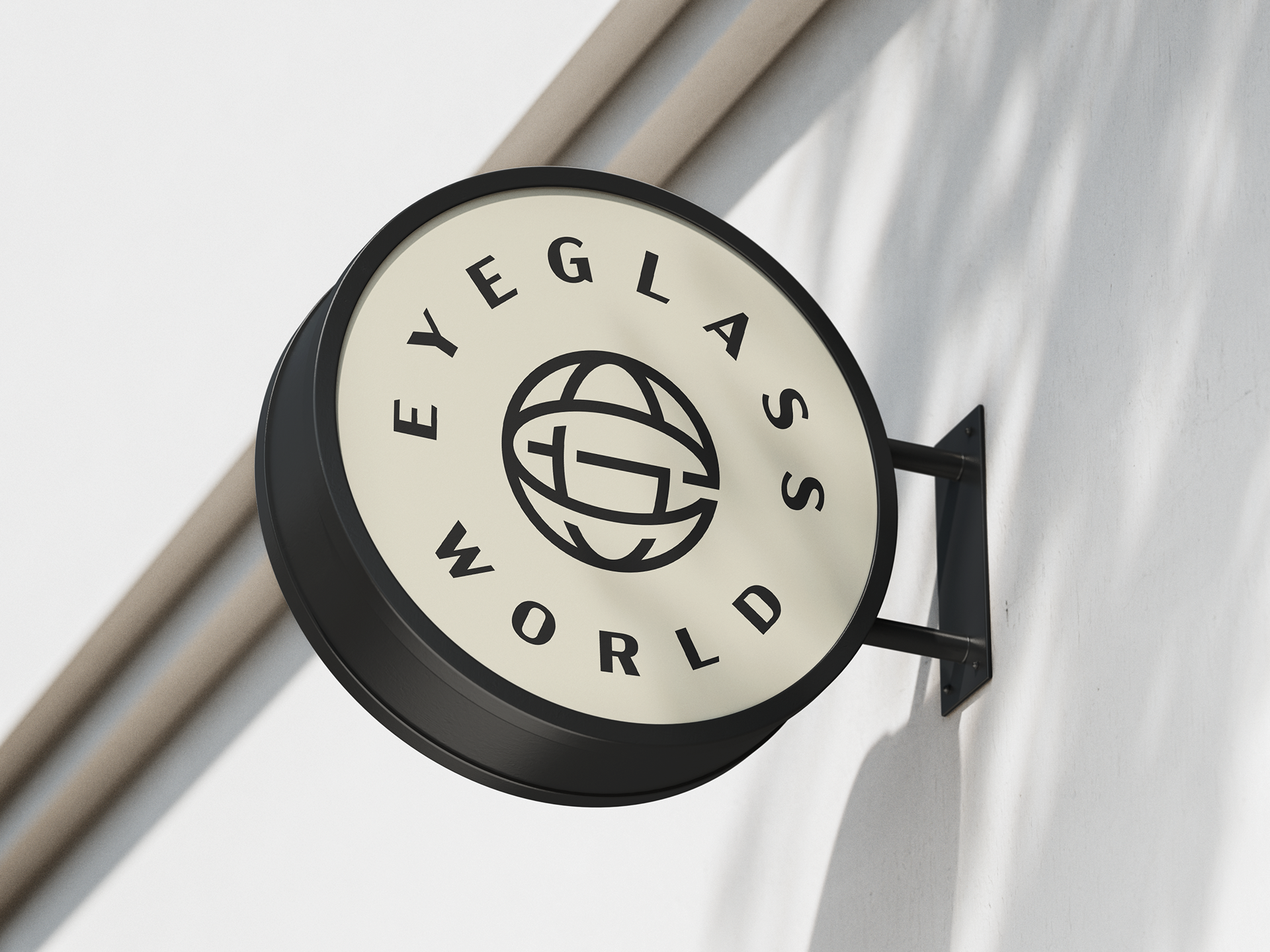
By taking a customer-first, style-forward approach, we were able to reposition Eyeglass World as a boutique, localized experience with a warmer, more refined brand expression.

The refreshed brand mark dials up an emphasis on “World” with a powerful monogram device that only Eyeglass World can own.

Our logo is symbolic of Eyeglass World bringing your world into focus. The icon conveys connectivity through abstract integration of the letters "E" and "G," which weave together to form a unified “World” emblem.

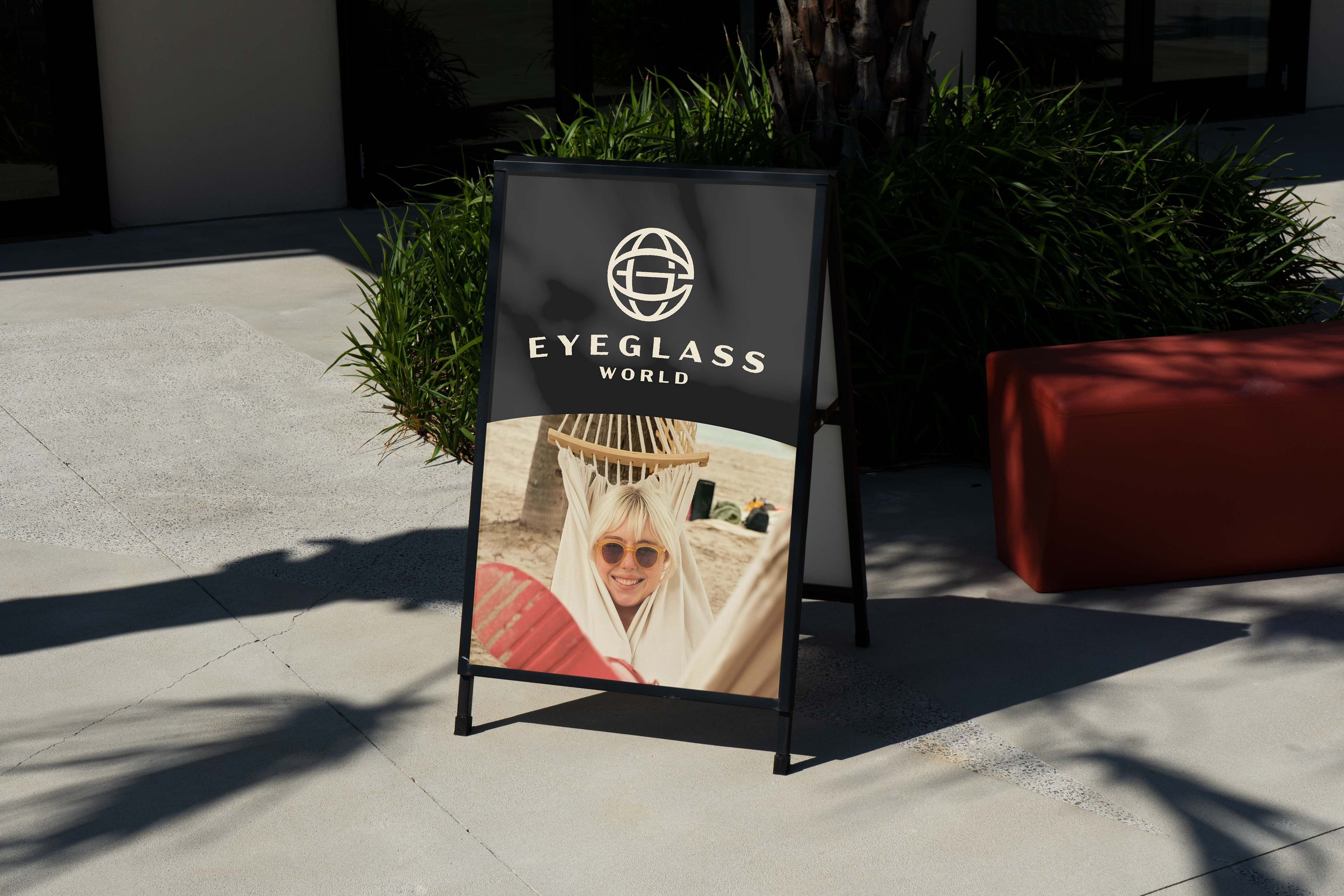
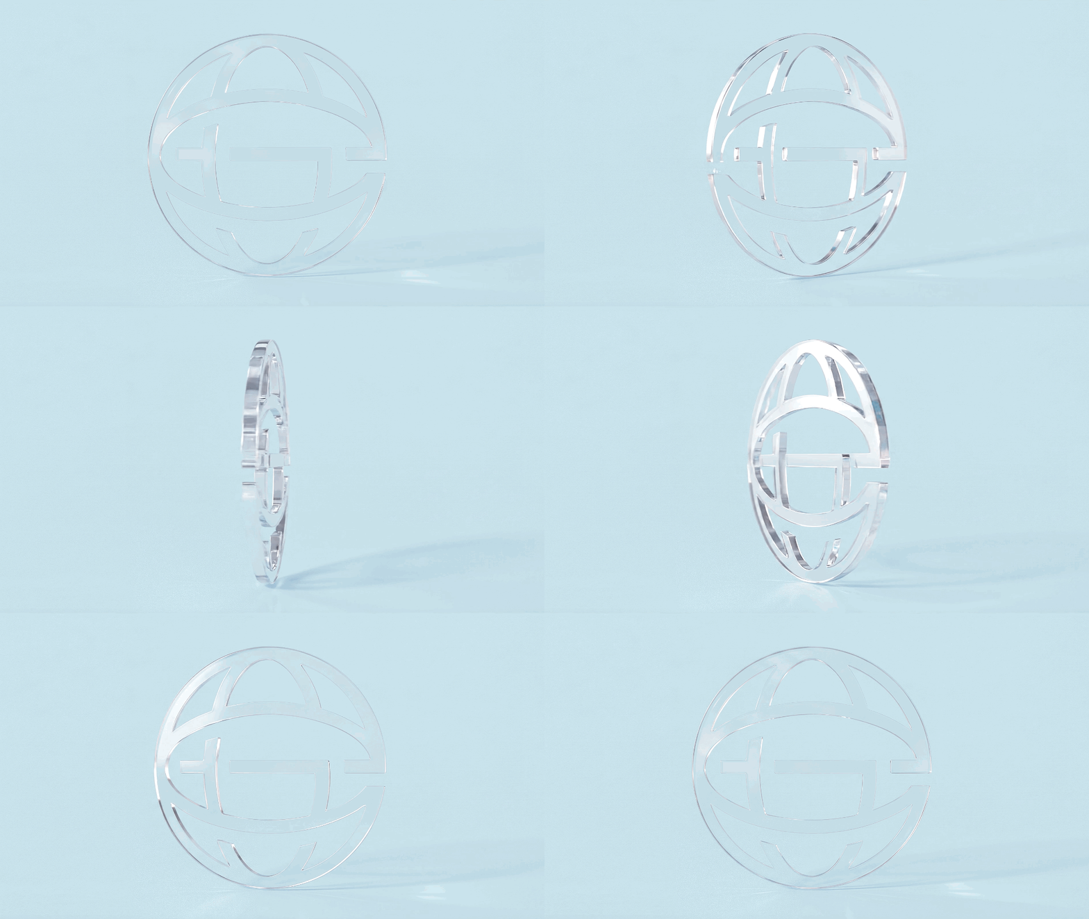
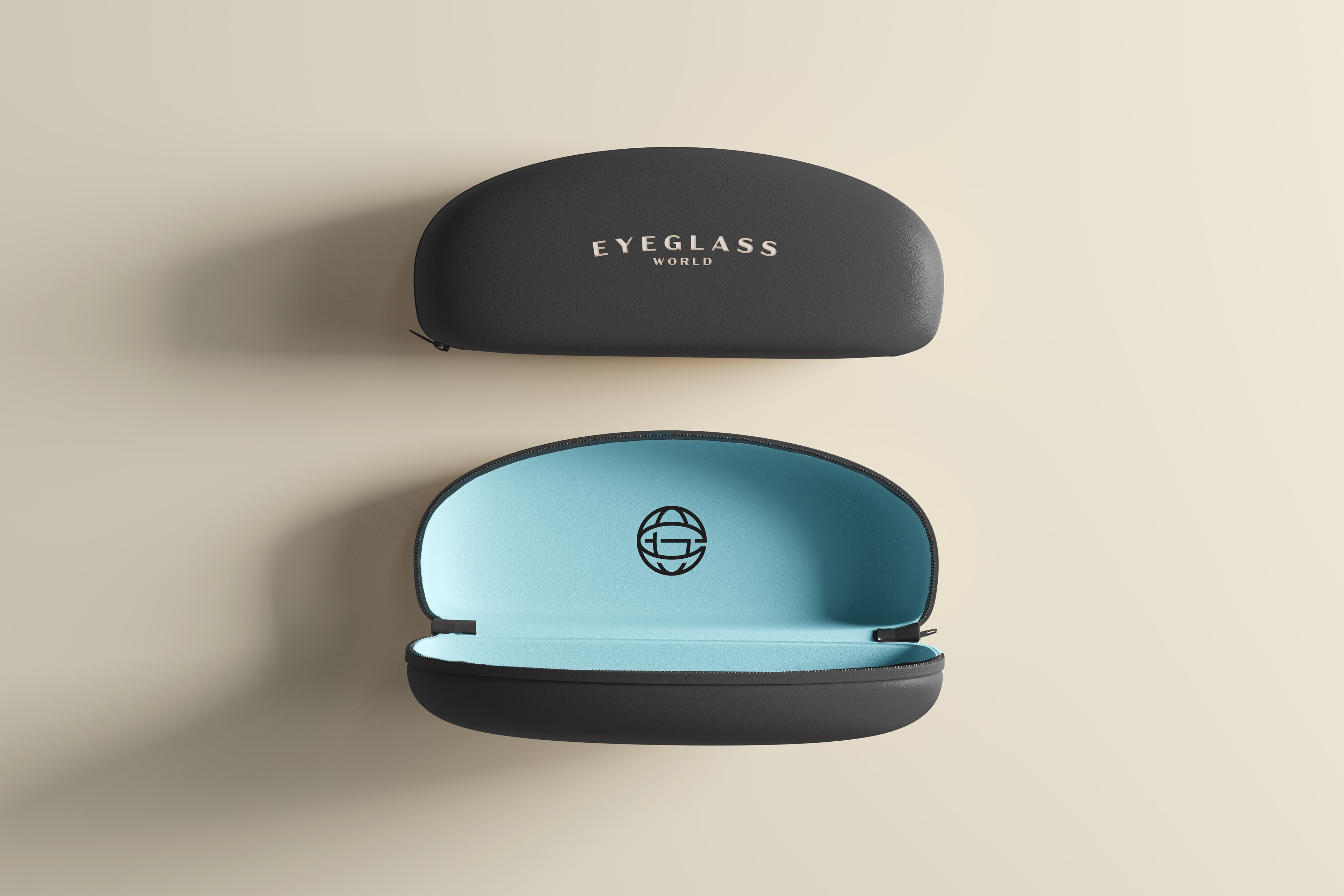



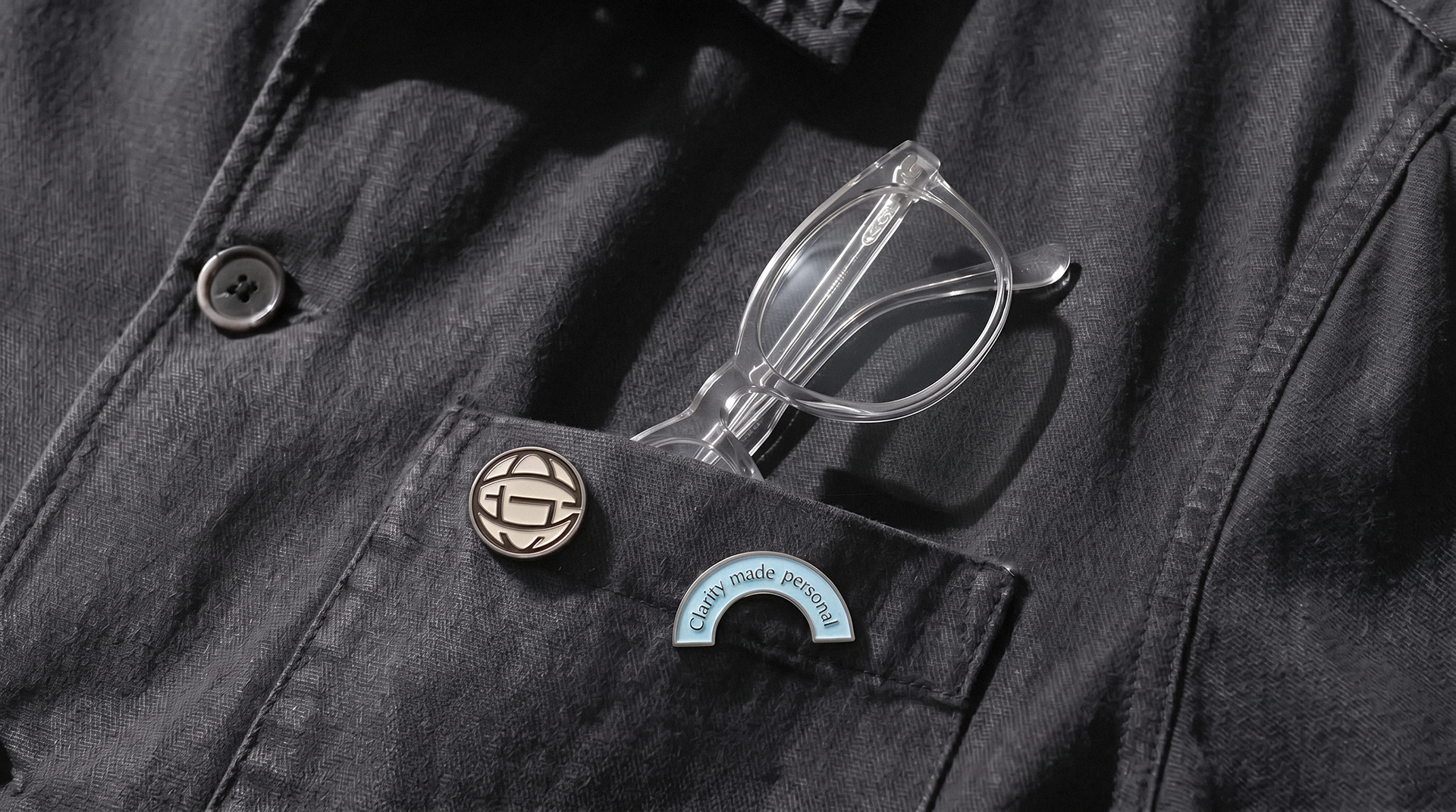
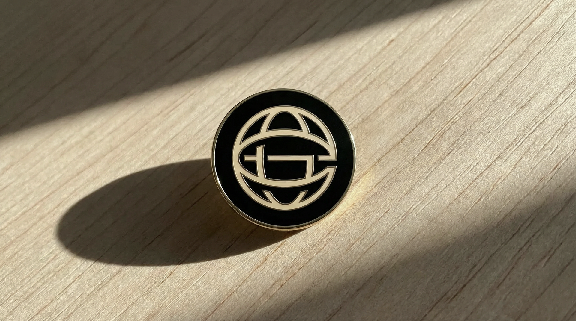

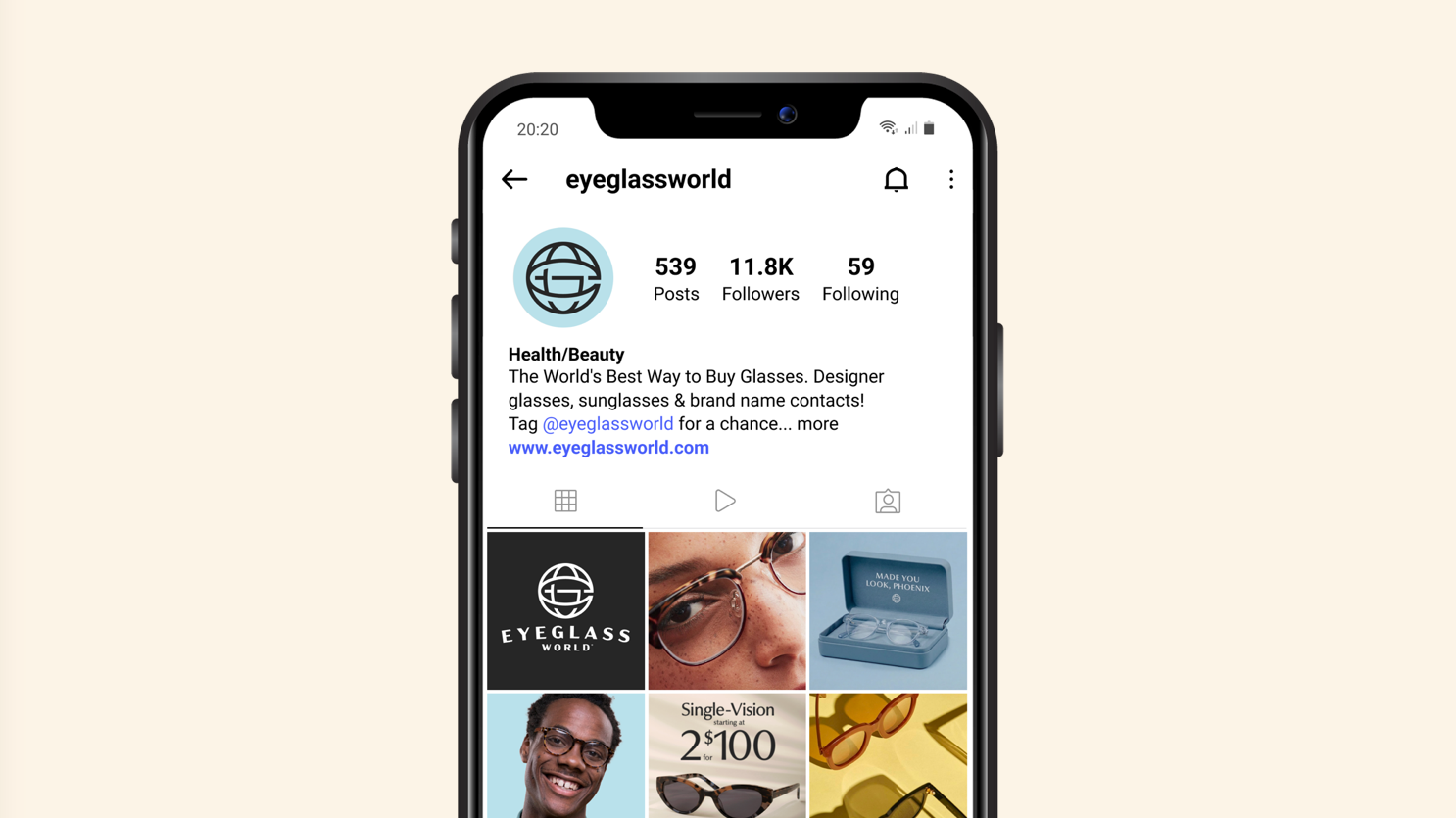
The brand mark can flex in a variety of ways that bring the location into focus.

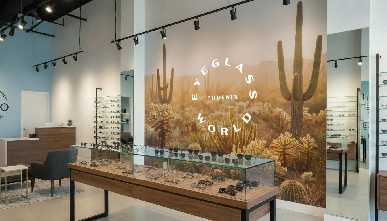
The color palette is designed with balance. Our cool, neutral tones set the foundation of the brand with modernity, while a range of warmer hues softens the system to add approachability and humanity.


PP Museum is a masterfully crafted humanist sans-serif typeface, embodying the perfect blend of elegance and versatility. PP Museum has similar characteristics that pair wonderfully with our logotype and retains legibility at small sizes.


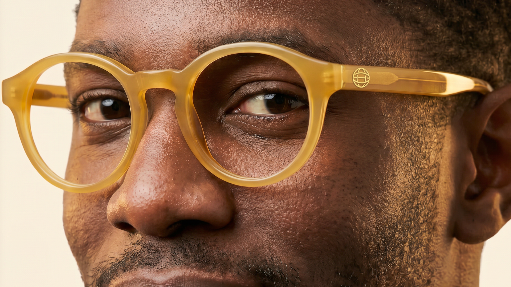
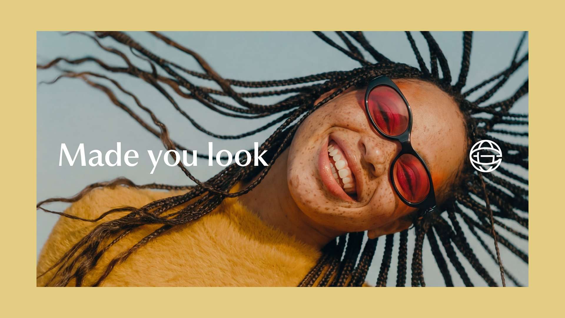
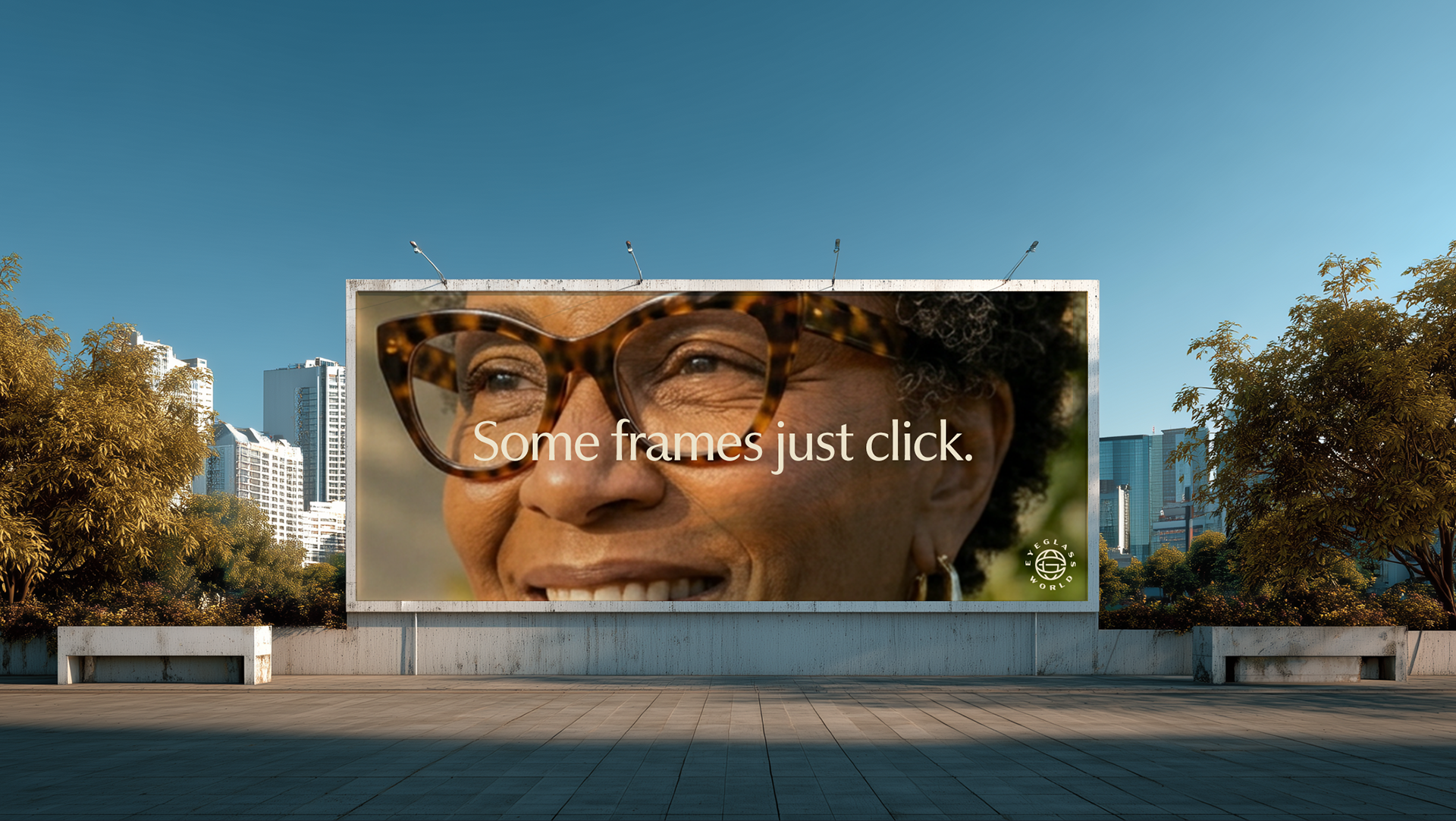
The Eyeglass World image library is composed of studio and lifestyle photography. Based in our brand color palette, our photography style is aspirational, authentic, warm, and friendly.




Agency: VML
Chief Design Officer: Robb Smigielski
Group Design Director: Jason Borzouyeh
Design Director: Andrew Mirakian
Associate Design Director: Carolyn Pokorney