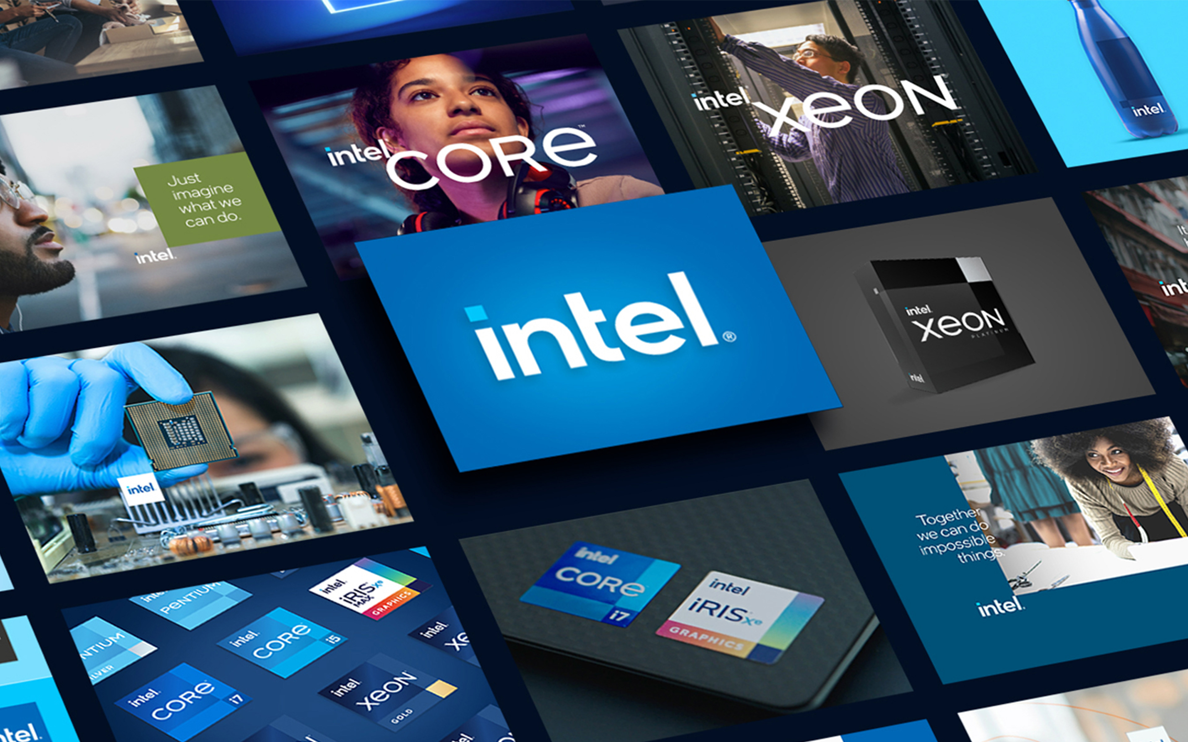
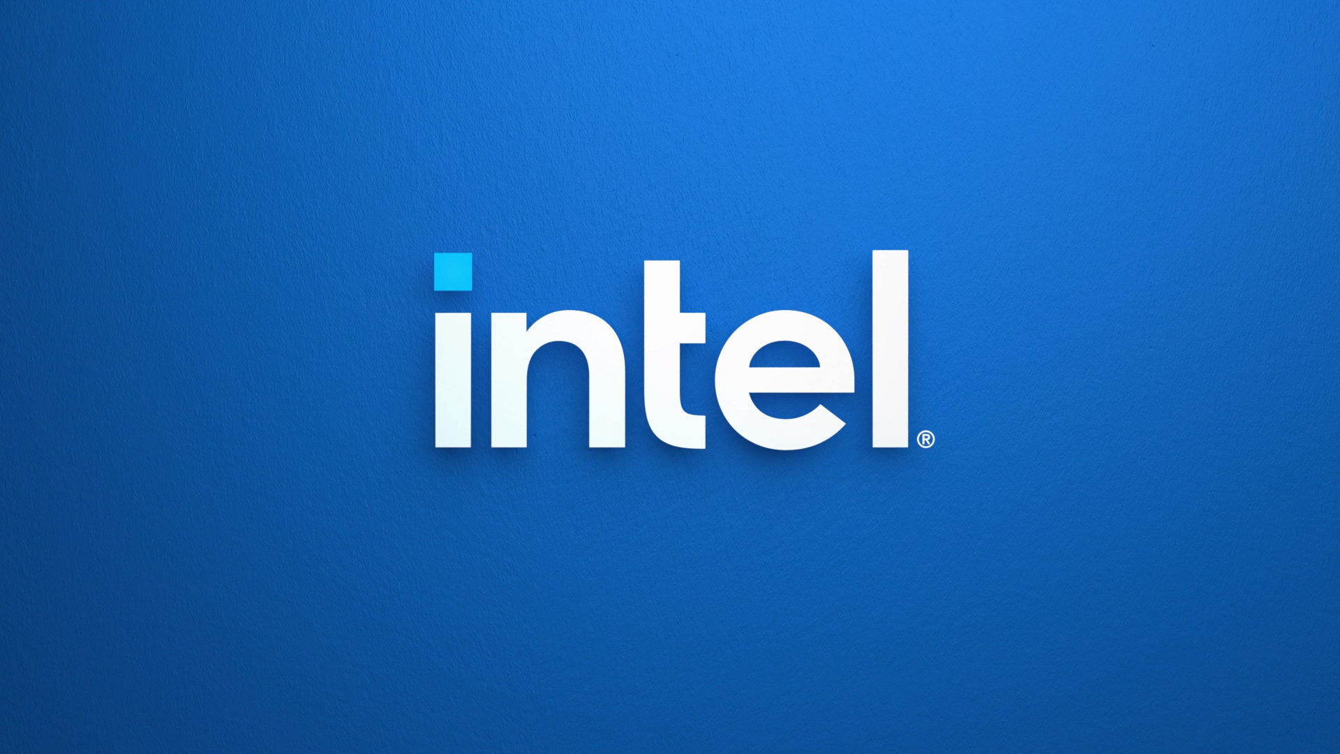
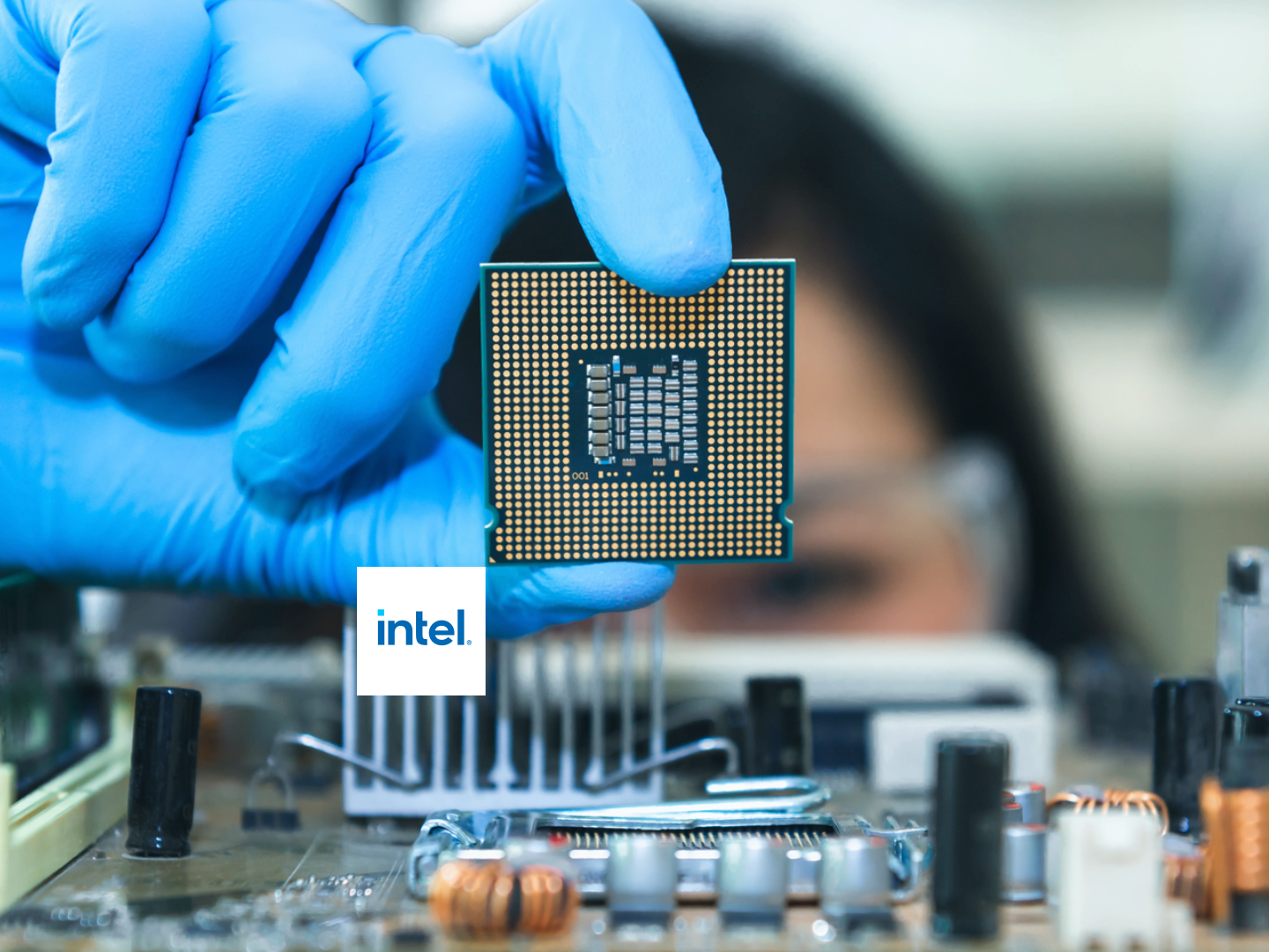
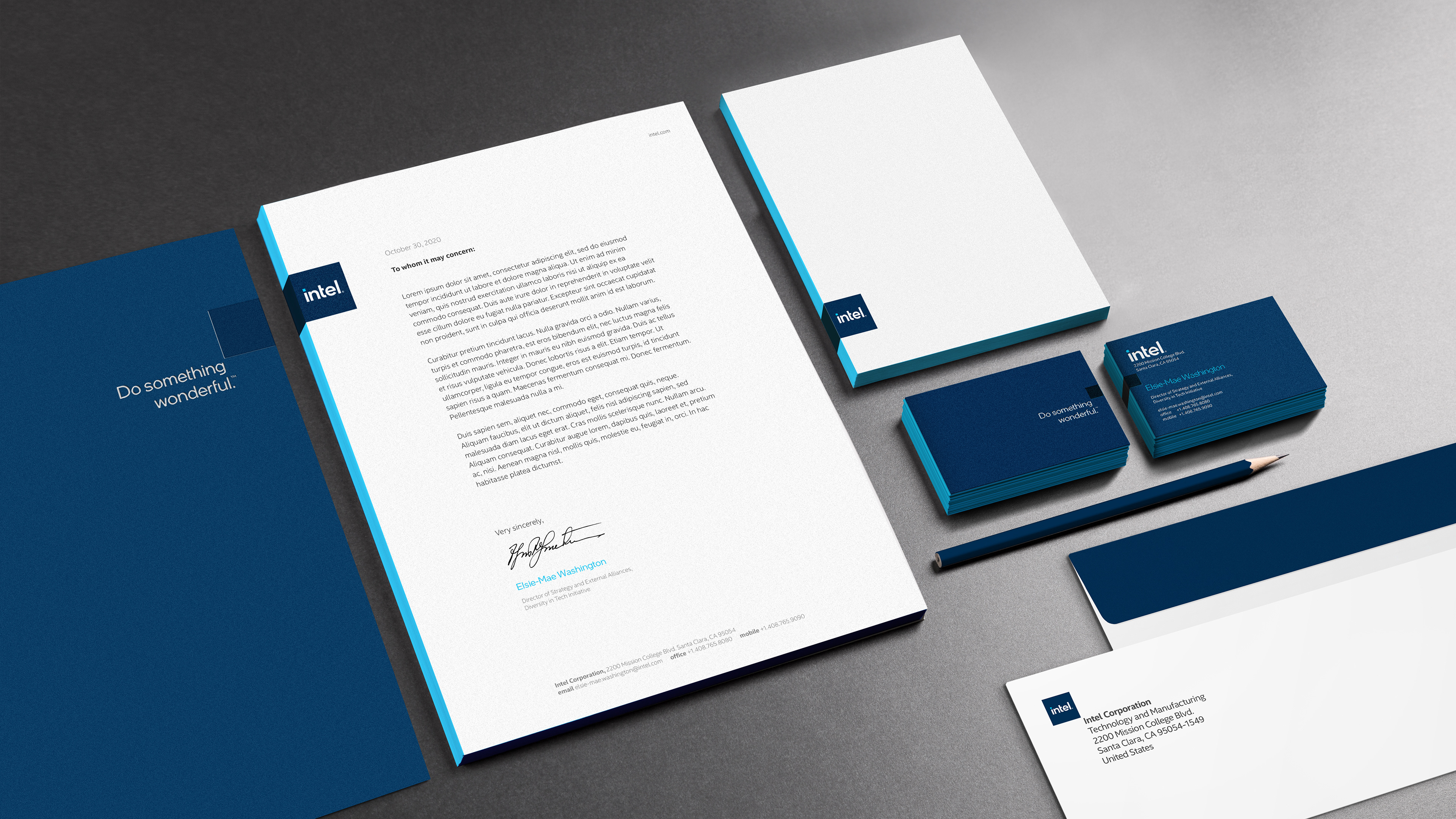
For only the third time in history, Intel evolved their iconic logo and revitalized their brand. The new logo is simple, confident and transformational. It represents a dramatic simplification of the Intel brand identity.
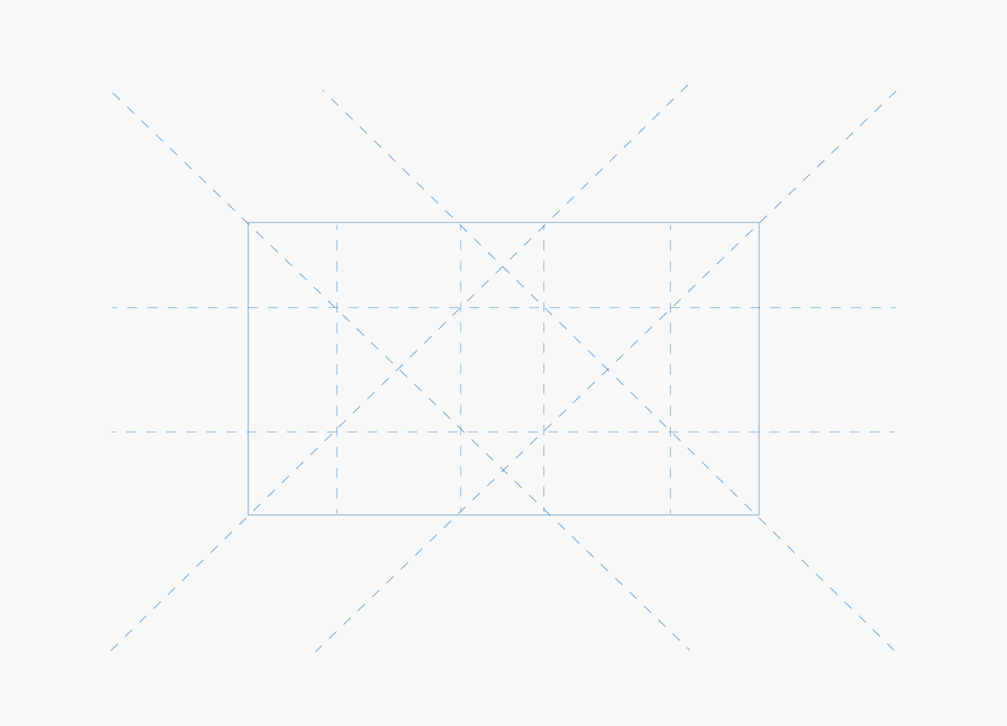
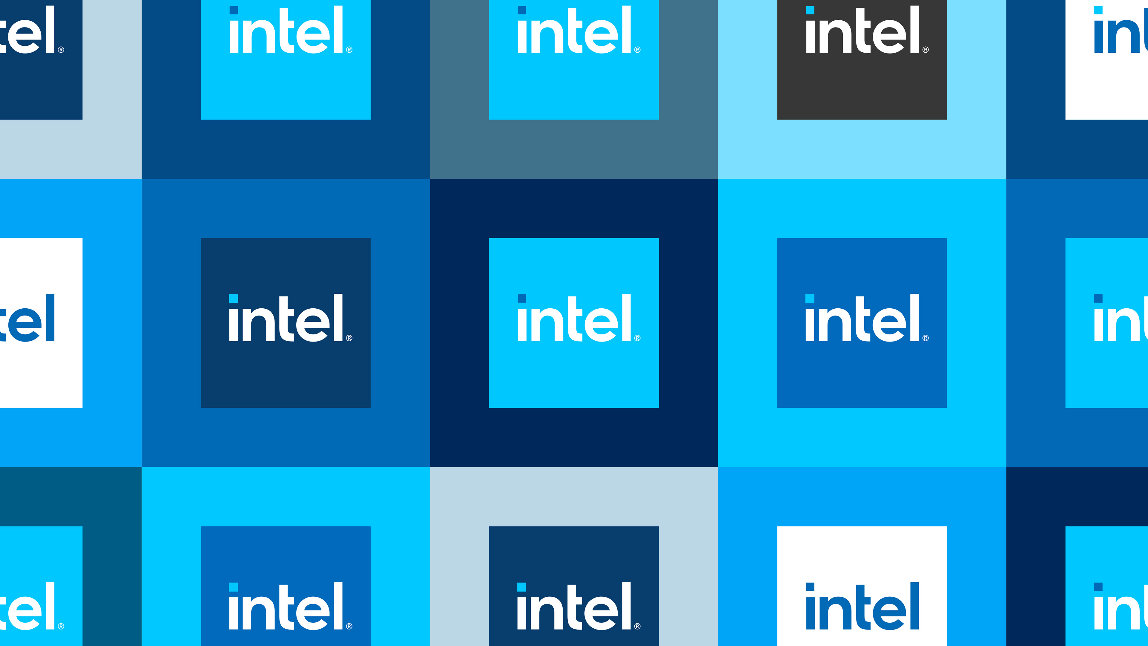
Crafted with an underlying geometry, Intel's new logo has a refined symmetry, balance and proportion that is both understated and iconic.
The new logo is a modern evolution, but retains strong visual elements of their legacy brand marks — making it feel both familiar and new.
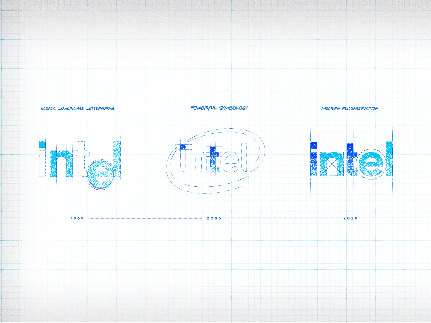
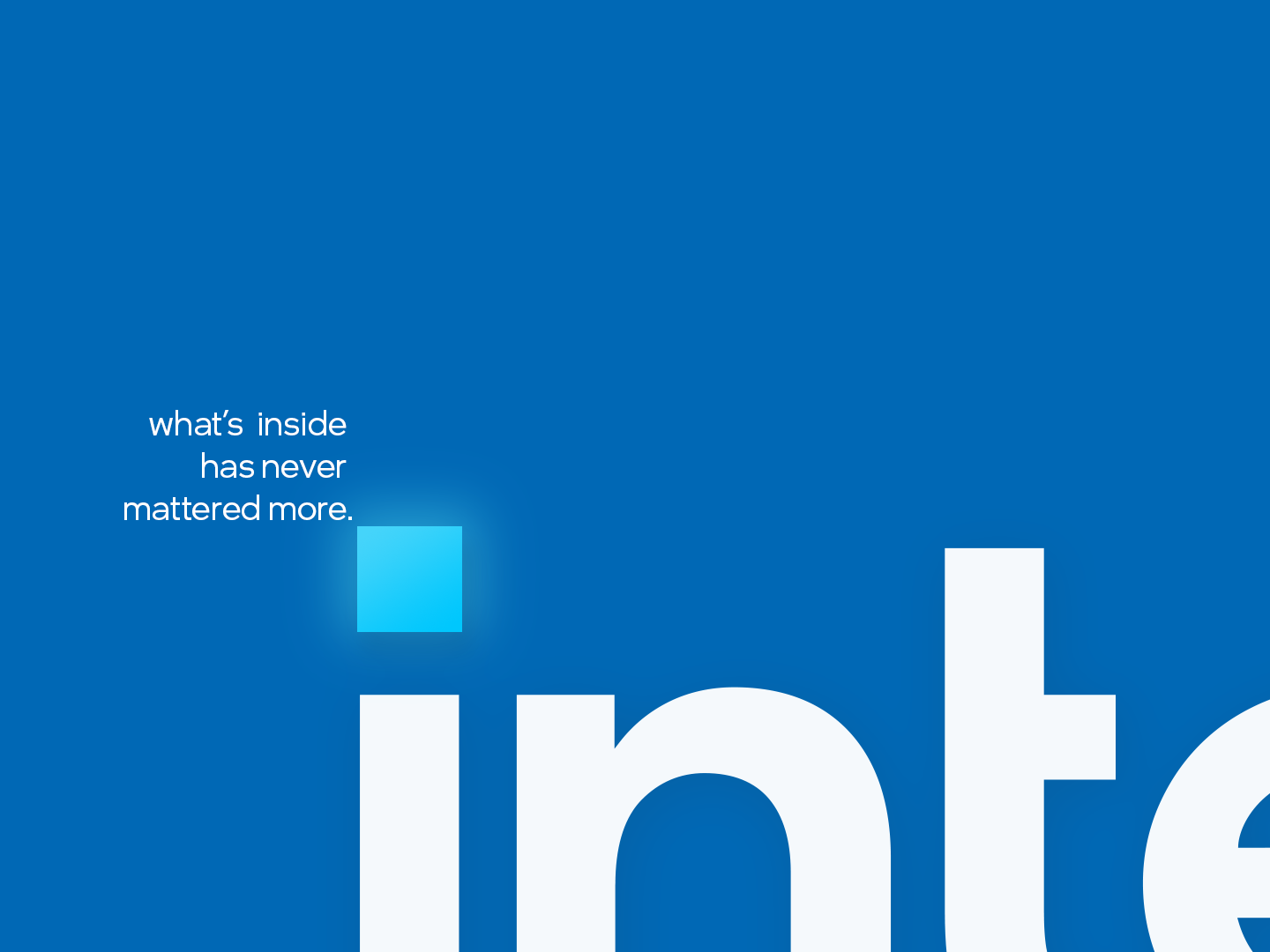
The dot of the "i" represents the potential and power of the Intel processor. It is the only symbology in the logo and the only symbol Intel needs. Like a catalyst, it represents the power of what’s inside.

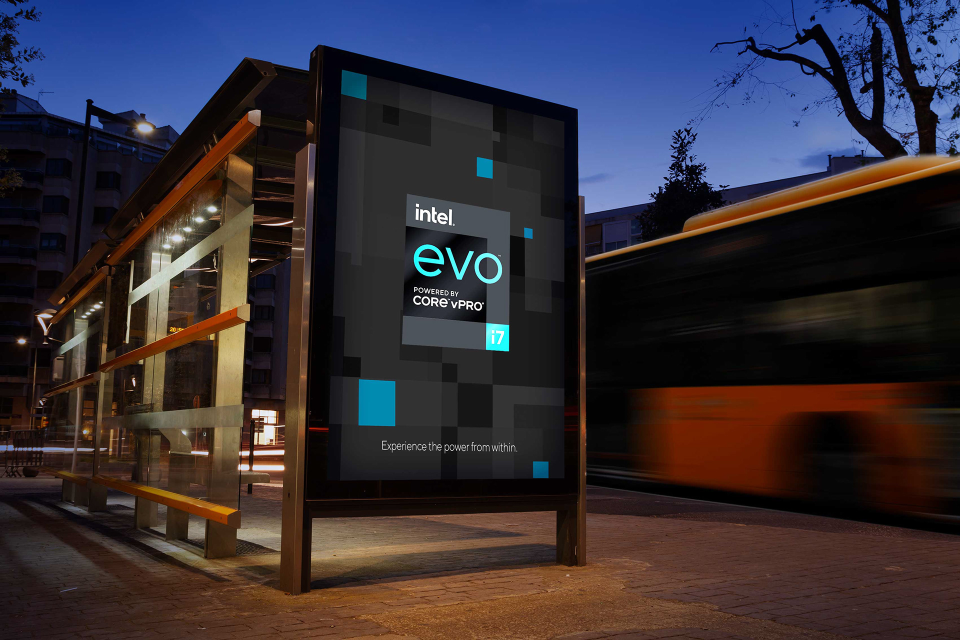
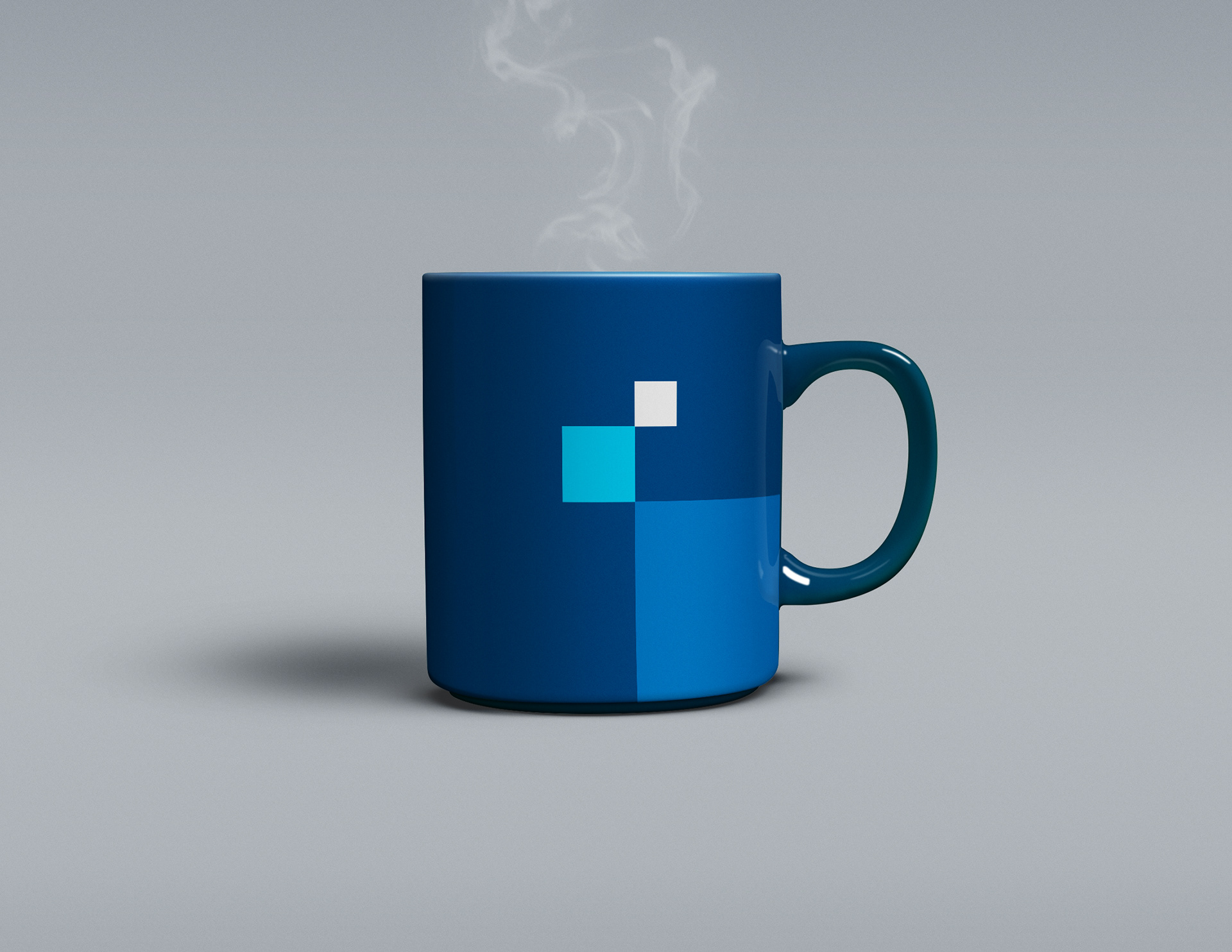
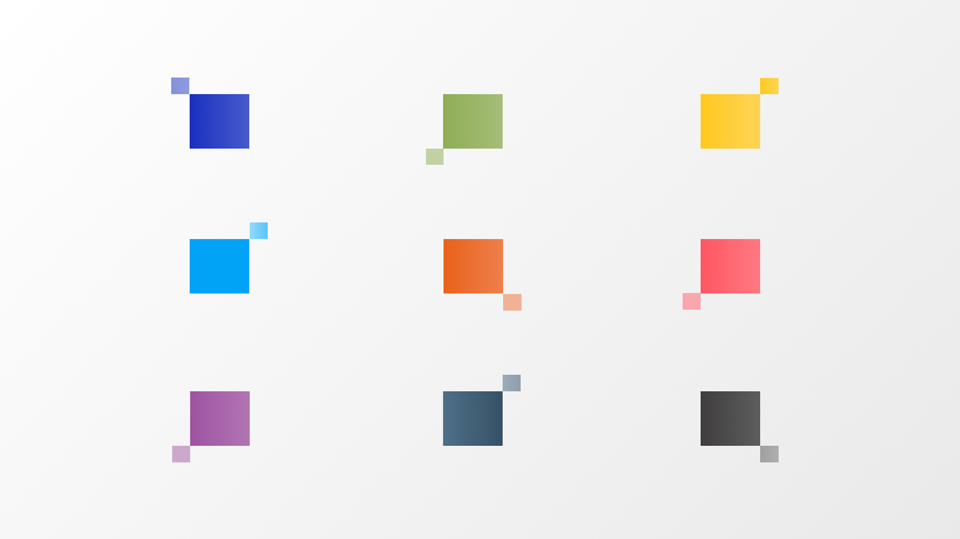
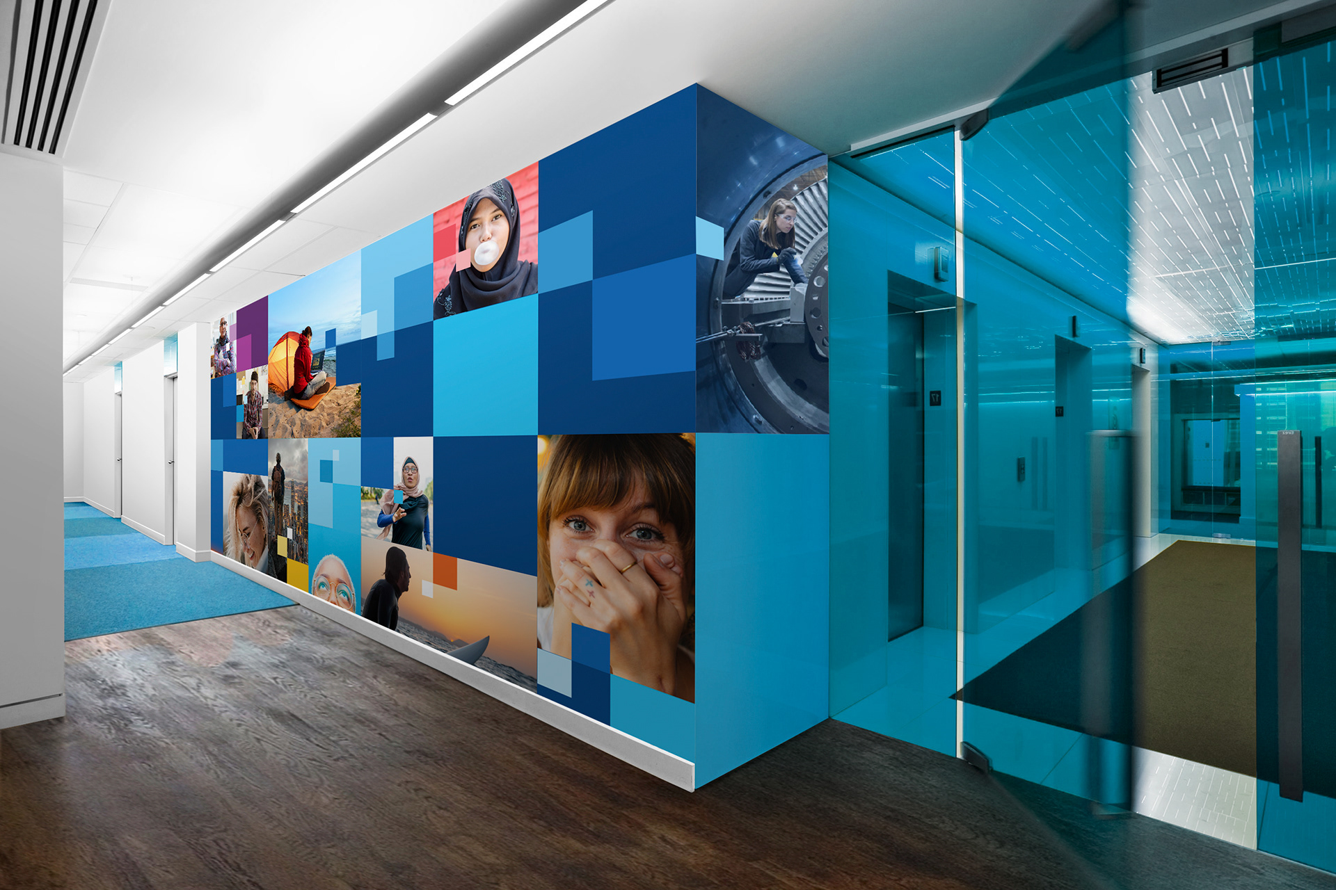
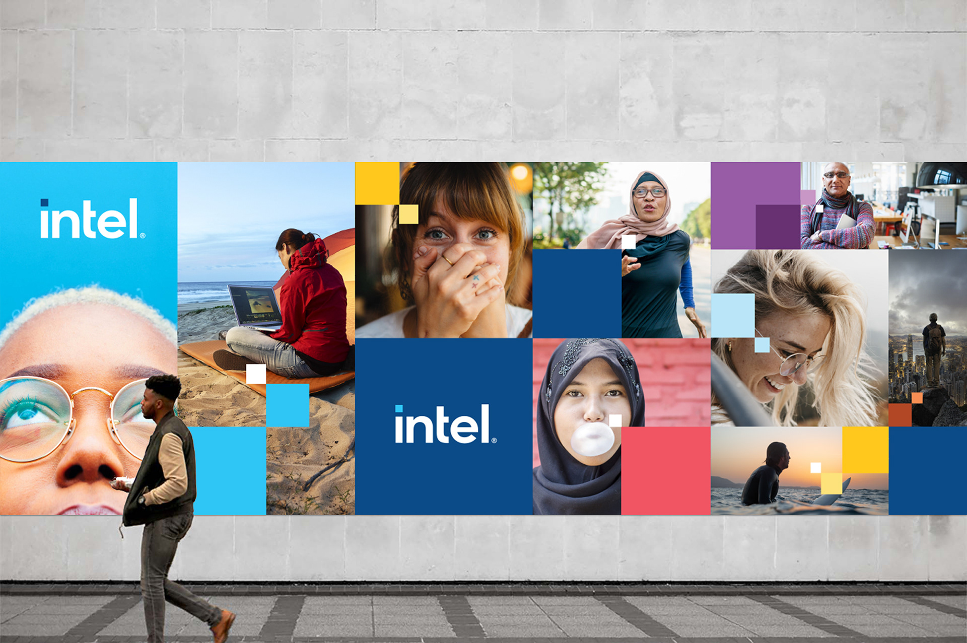
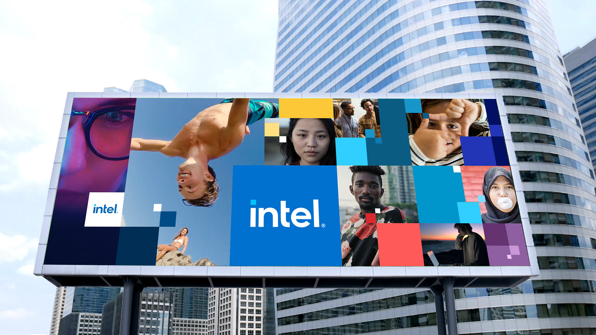
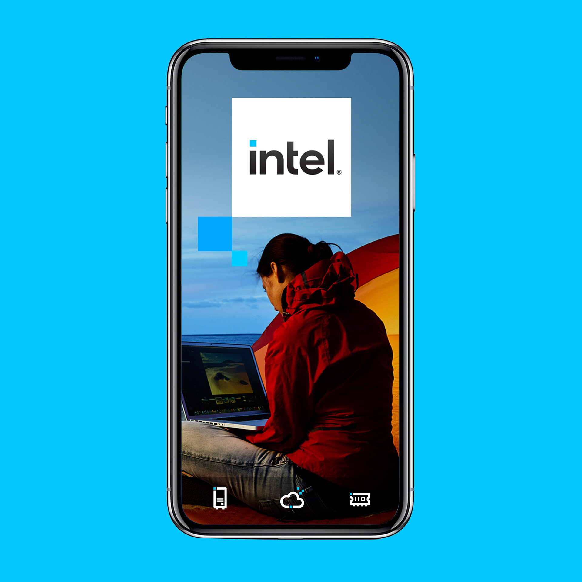
The foundation of the new Intel master brand visual language is an iconic graphic device we call "The Spark." The Spark is a corner-to-corner relationship between a small square and a larger square. It visually represents Intel technology as the catalyst for bigger, world changing ideas.
Literally illustrating the ability to spark what’s next, this graphic device can be seen in all aspects of Intel’s new brand identity and visual language. Its' influence informs everything from the new badge designs to marketing layouts and beyond.


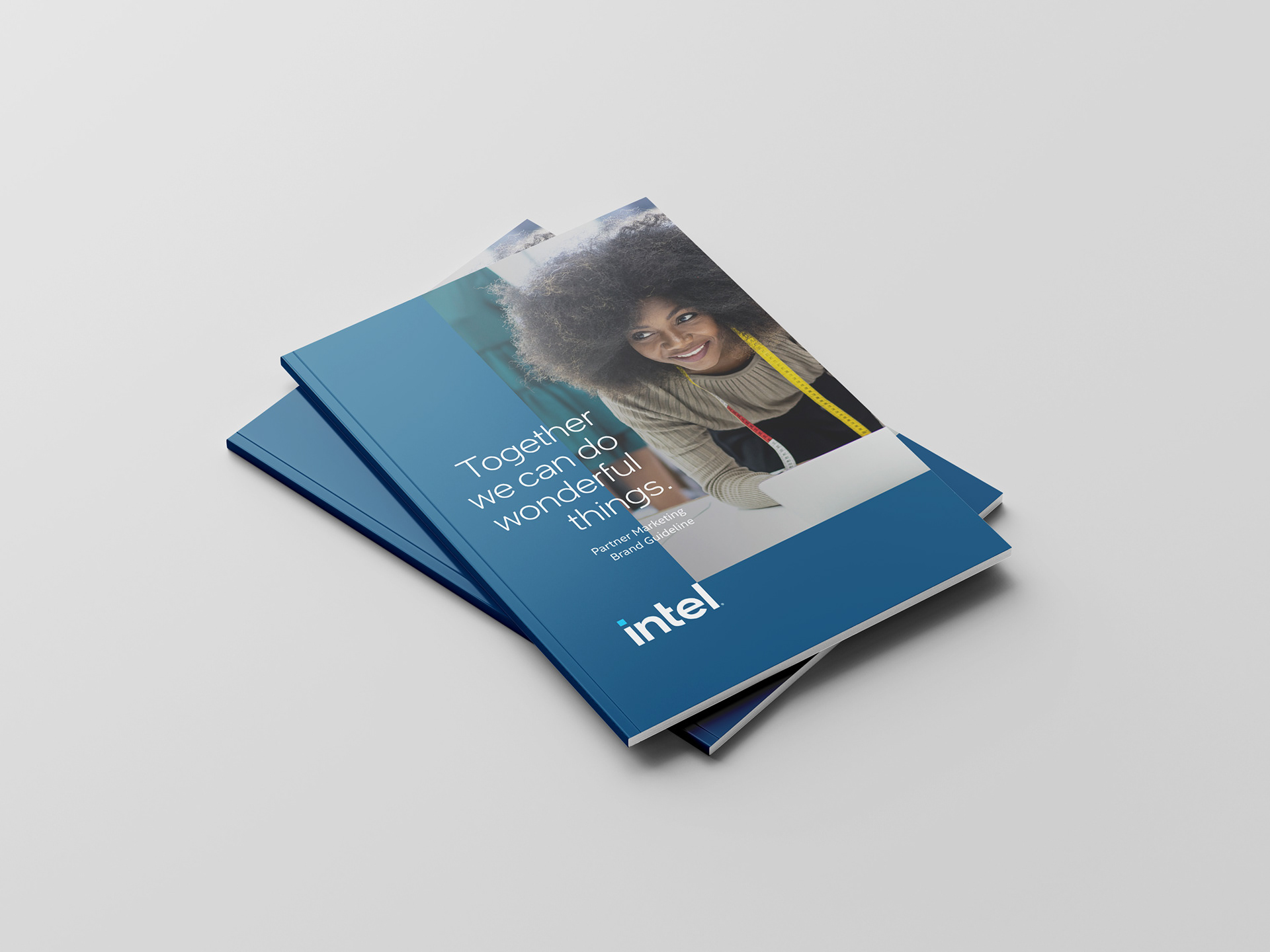
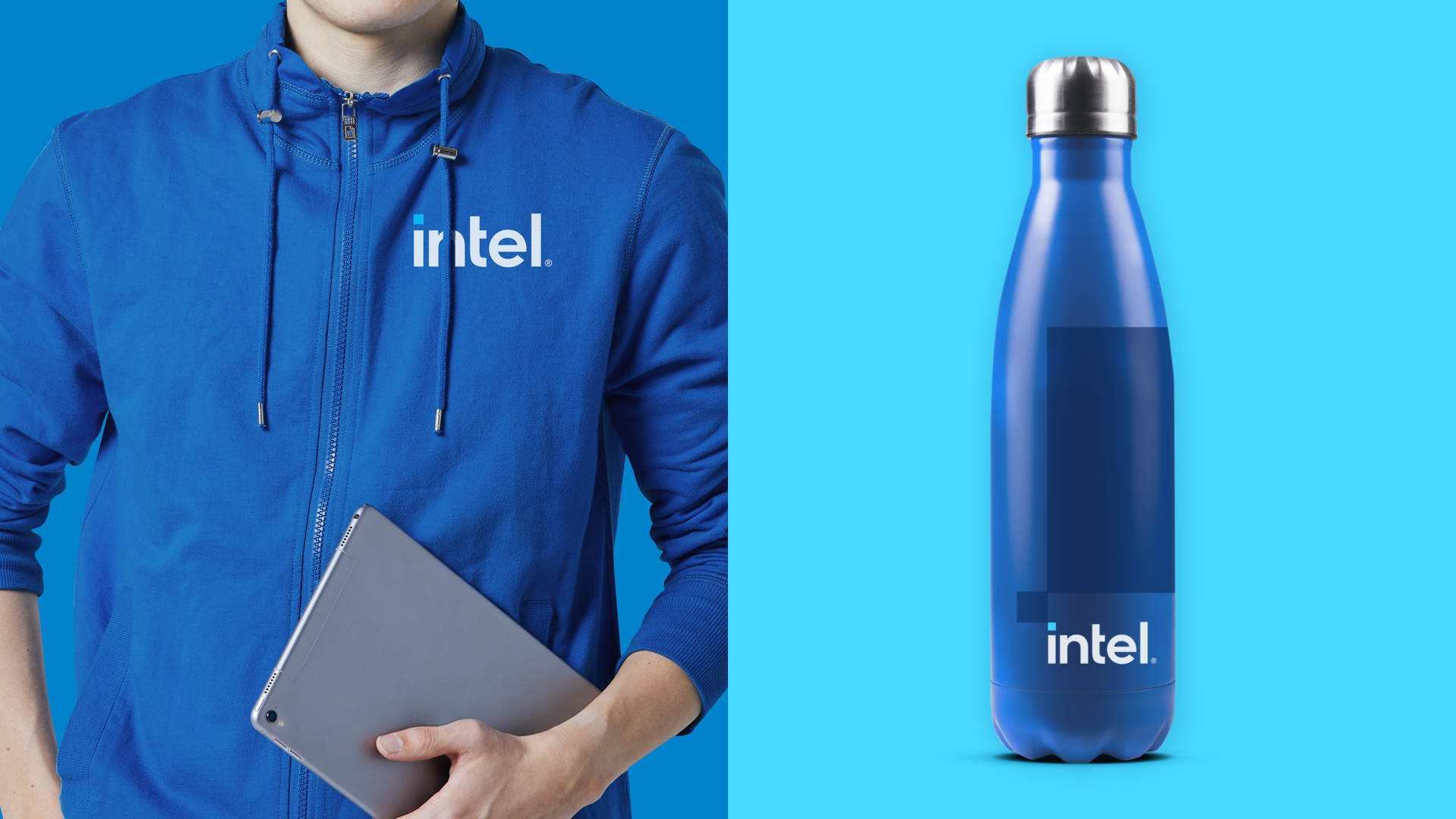
To better reflect Intel’s impact on a diverse world and enable the brand to express itself dynamically, the new visual language strategically embraces a bold, new and expanded color palette. While the new brand expression strategically expands the use of a wider palette, it maintains a strong connection to Intel Blue and remains a blue first brand.
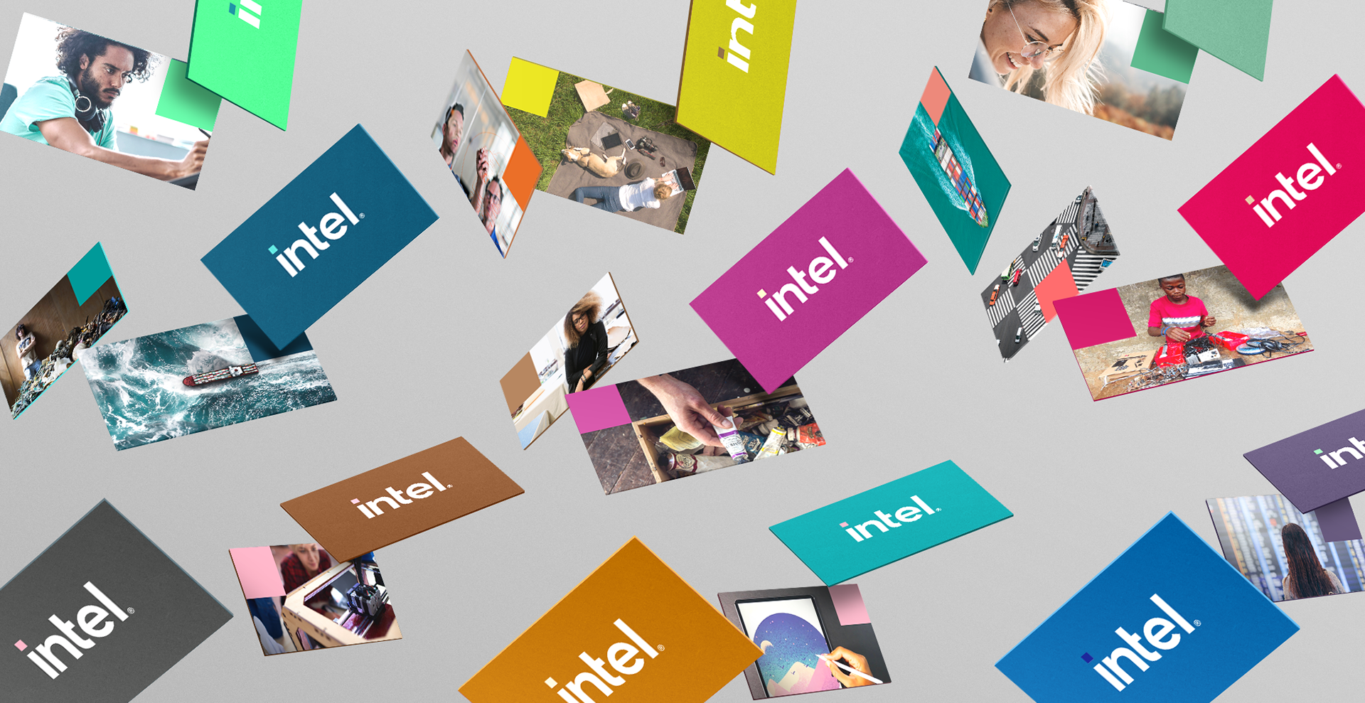
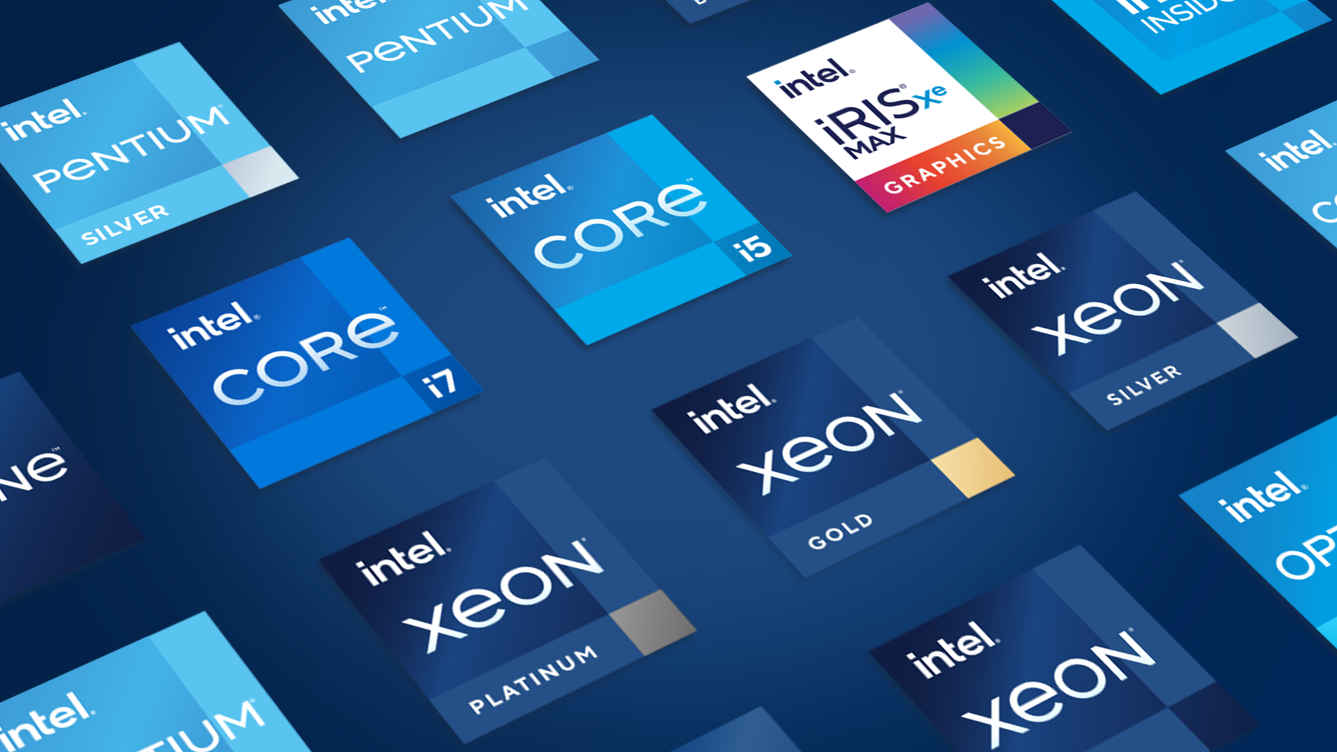
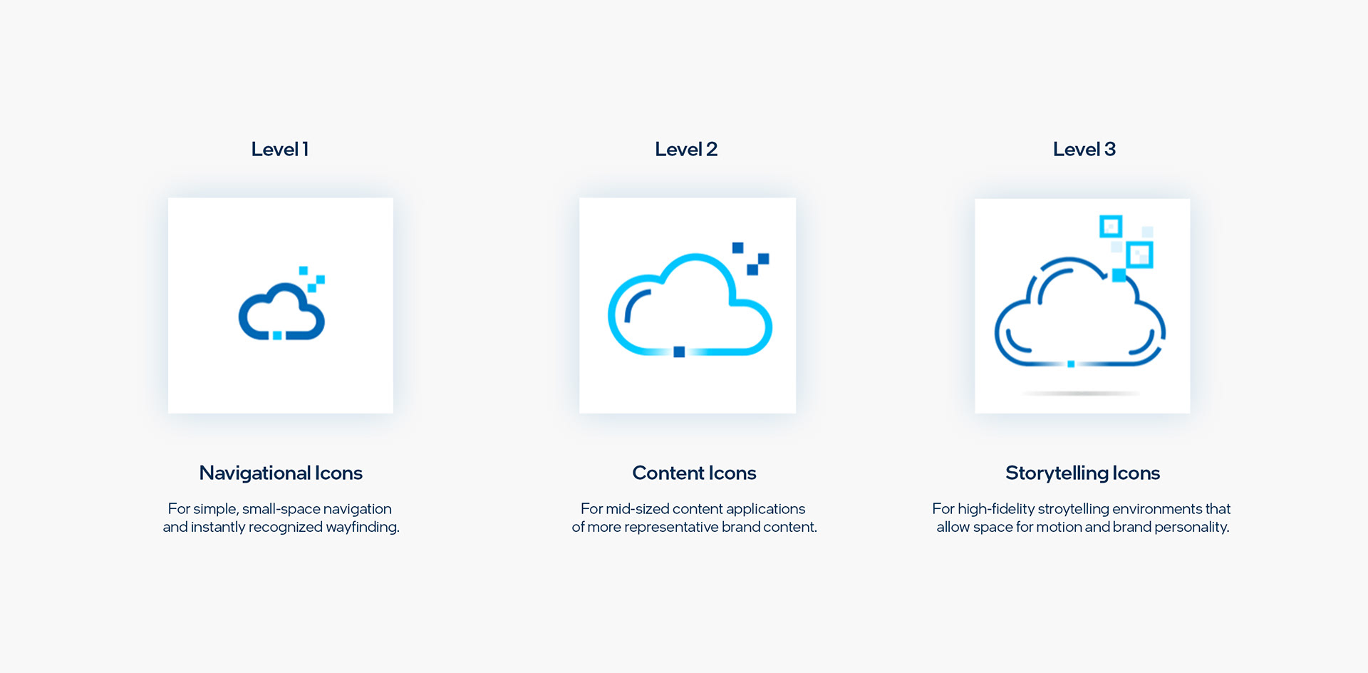
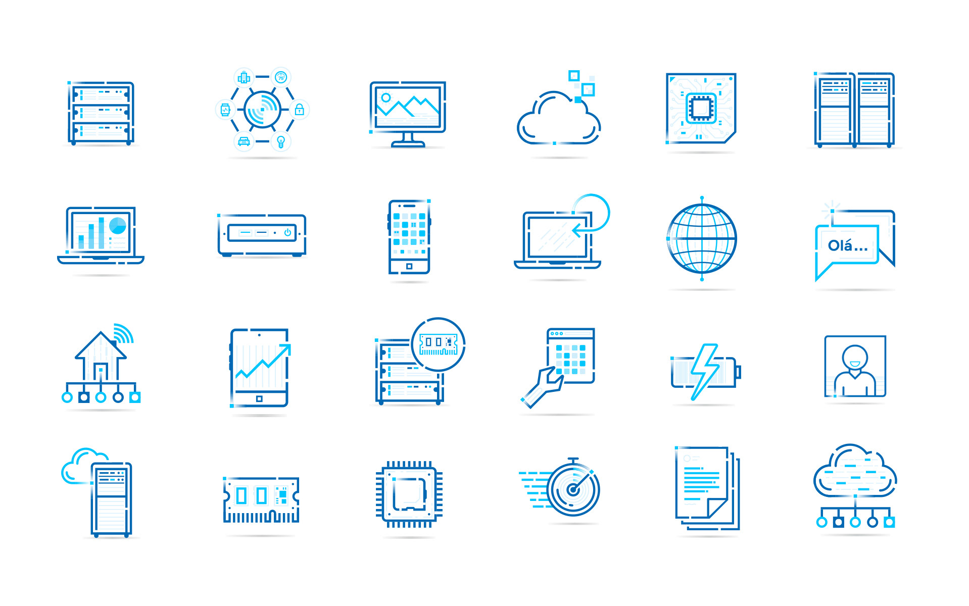
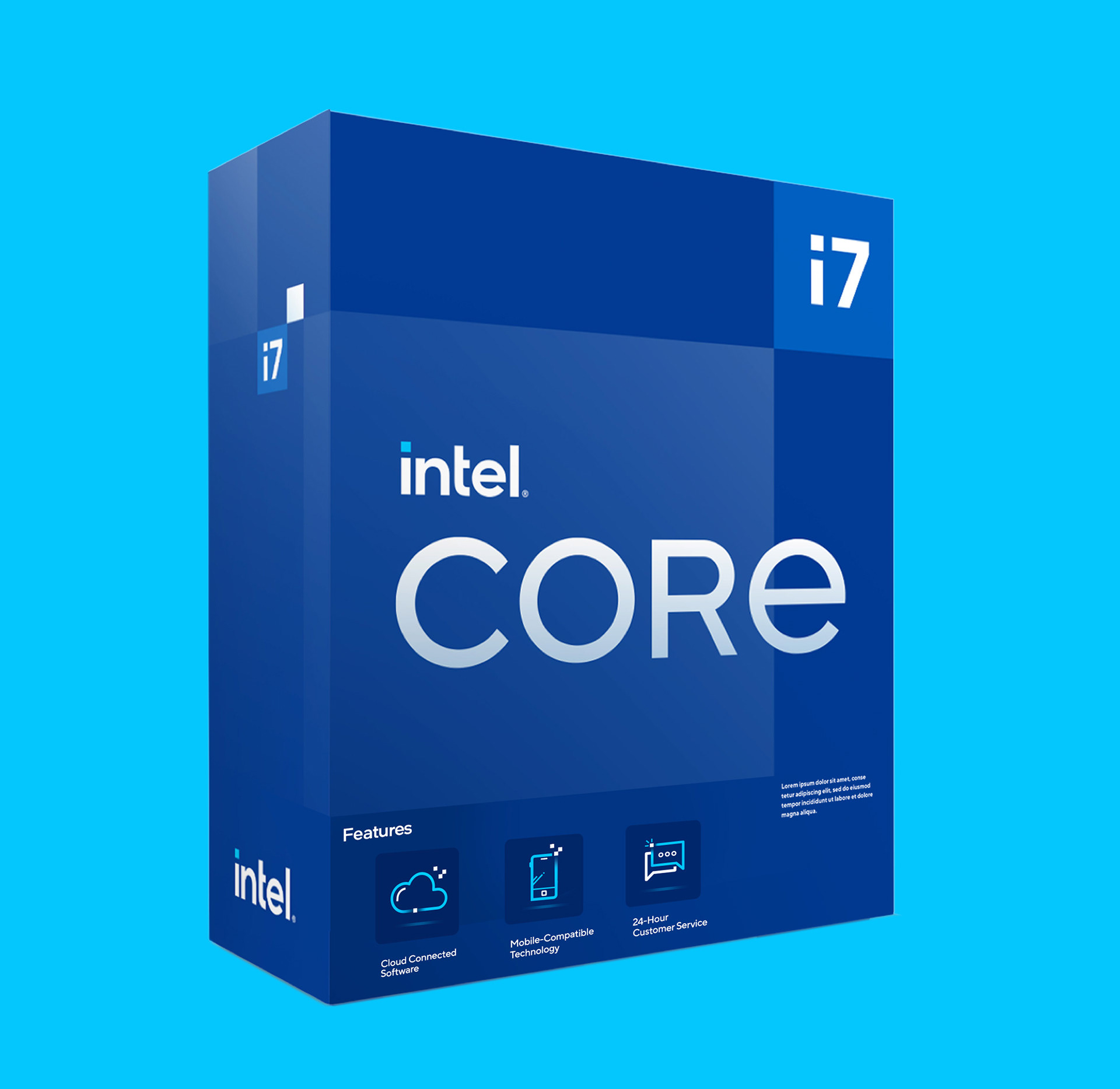
The newly developed icon system establishes a more unified, consistent and flexible standard across all Intel properties. It is built on a multi-level, fidelity-based framework that embodies the new “Spark” brand motif.

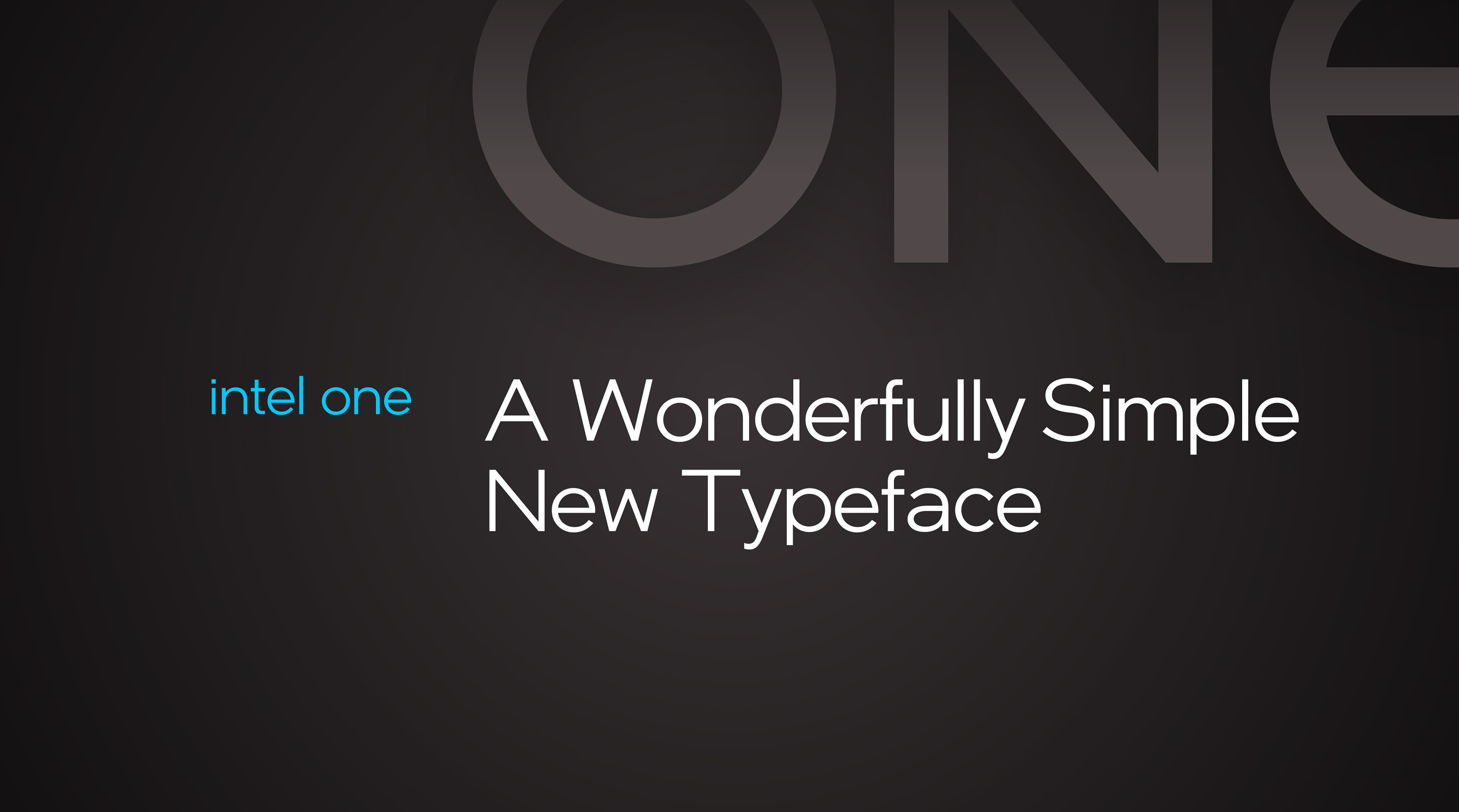
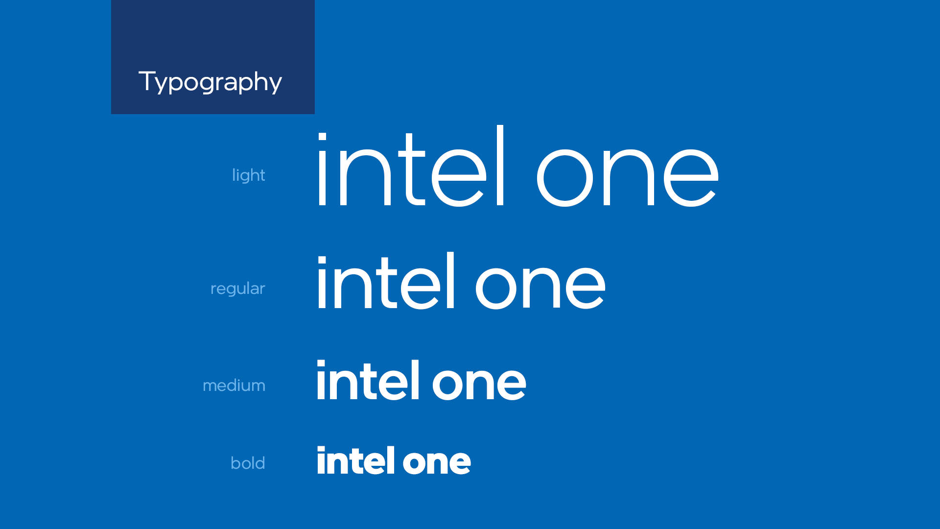
We created a proprietary brand font family called Intel One. This typeface was carefully crafted to consider and incorporate the modern, geometric sensibility established in the new logo as well as the highest standards of modern typeface design.


CREDITS
Agency: VMLY&R
Team: Brand ID
Robb Smigielski - Head of Design
Michael Eppelheimer - Group Design Director
Dave Swearingen - Group Design Director
Maurizio Villarreal - Group Design Director
Kevin Lee - Design Director
Jason Borzouyeh - Design Director
Andrew Mirakian - Associate Design Director
Chris Thomas - Associate Design Director
Matt McNary - Associate Design Director
Nate Hofer - Associate Design Director
Trent White - Associate Design Director
Caleb Newberg - Senior Designer
Mars Denton - Senior Designer
Jang Cho - Senior Designer
Carson Catlin - Integrated Production Supervisor